


System overview graph view
Open the System overview from the Infrastructure link in the navigation pane. The default view displays graphs for the Snaplex services and the nodes on which they run:
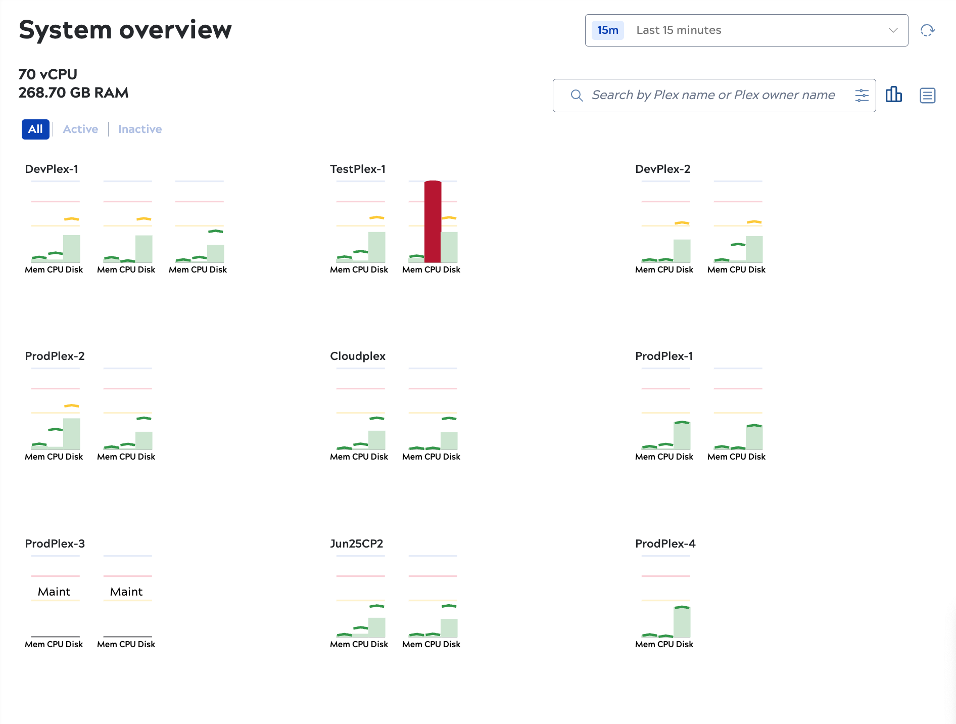
When the System overview page opens, it shows the Snaplex Node graph view and the average percentage of memory utilization for the last 15 minutes. The total number of virtual CPUs (nodes running the Snaplex service) displays at the top left, along with the total amount of memory allocated.
Snaplexes with no nodes are offline. You can also put nodes in maintenance mode, which means the Snaplex service is running but isn't processing requests. For example, ProdPlex-3 in the screenshot above has two nodes that are both in maintenance mode.
In the node graph view:
- Bars represent the average for memory, CPU utilization, and disk utilization for the selected time period
- The carets mark the maximum values during the selected time period.
- Bars and carets are color-coded: Green indicates values up to 45%, yellow indicates up to 75%, red indicates over 75%.
- Nodes with average or max values in the yellow or red range show at the top of the page.
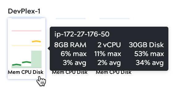
- Hover over a node to view the actual values for the bars and carets:
-
From the System overview page, you can:
- Assess Snaplex status. Nodes with yellow or red bars show at the top of the page.
- Change the time period or refresh to recalculate average and max values.
- Click a Snaplex to open details, including:
- Nodes.
- Alerts.
- Activity logs.
- Click a node to open details, including:
- Metrics.
- Associated executions.
- Additional details such as IP address, file descriptors, and URI.
- View the maximum and mimimum values for configurable properties and the current JVM settings compared with recommended values. Learn more.